Design system
The rules behind this site
This is the same system davidglazier.com runs on, extended with one gradient from my portfolio deck. Nothing here is described from the outside: every swatch, specimen, and component on this page is the live one, so what you read is what you are looking at. Flip the theme in the header and watch the roles repoint.
Principles
Elegance is what is left after the rules
- Say less, show the phone.A claim gets one number and one screen. If it needs a paragraph, the design is not done.
- One accent, one highlight, one signal.Sage carries links and labels. Light blue is the only highlight, flat behind the line that matters. Marker yellow is a small signal, never text.
- Medium is the loudest weight.Headlines sit at 500. Semibold is reserved for numbers, so a number always reads as a number.
- Motion on transform and opacity only.One easing family, nothing over a second, nothing that bounces. The hero letters also fade in color once on load, the one exception. Reduced motion turns all of it off.
- Visible at rest.Every element is on the page before any script runs. Scripts add the entrance, never the content.
- Scroll is the clock.Chapters pin, product screens step forward, and pull lines ink in at the reader's pace. A walkthrough that plays on its own always shows pause, back and next. Where the browser can bind an animation to scroll it runs the choreography itself; elsewhere the observer entrances take over, and the page reads the same either way.
- Contrast is a number, not a feeling.Every text role clears WCAG (Web Content Accessibility Guidelines) AA on every surface it is allowed to sit on. The table below is the proof.
Color
Roles, not hexes
Components name a job, never a color. The ground is the davidglazier.com canvas, a cool near-white with three soft strands drifting under the page; on it, charcoal ink, a sage accent, and one copper-to-navy gradient for display moments. Dark mode repoints the same roles.
Ground
- #F4F6F9#1C1B1APaperThe page ground, the davidglazier.com canvas.#F4F6F9 · dark #1C1B1A
- #FFFFFF#242322SurfaceCards and panels.#FFFFFF · dark #242322
- #EEF1F5#2C2B29TintQuiet tiles and the recommendations band.#EEF1F5 · dark #2C2B29
Text
- #1C1B1A#F8F7F4InkHeadlines and the line that matters.#1C1B1A · dark #F8F7F4
- #5E5954#DCD8D0MutedBody copy, the line that can wait.#5E5954 · dark #DCD8D0
- #66605B#A39D96SoftTags, captions and credits.#66605B · dark #A39D96
Accent, highlight and signal
- #4F6149#CBDDC5AccentLinks, labels, the loop and the focus ring.#4F6149 · dark #CBDDC5
- #CFE1EE#CFE1EEHighlightFlat behind the one key line in a section. Text on it stays near-black.#CFE1EE in both themes
- #F2B53A#E0A532SignalThe note rule, the ship step, the org chart lens. Fills only, never text.#F2B53A · dark #E0A532
Display
- copper to navy to steellight copper to mistGradientCopper to navy to steel, for display phrases and headline numbers. Never body text.copper to navy to steel · dark light copper to mist
- #343744 at 78%, tinted#242322, tintedTile glassThe four hero tiles. See through slate in light with a smooth bevel, charcoal in dark, one tint across all four. Numbers in Playfair Display, 24px and up.Light 3.8:1 large and 4.7:1 · dark 7.8:1 and 5.6:1
Dark fields and the thread
- #1E2D4A, lit#1E2D4A, litBand navyHow I lead, edge to edge, lit from the ring. Text inside takes light roles.#283D64 to #1E2D4A to #16223A
- #14213A#14213AMidnightThe trust cover.#26395E to #14213A to #0A1222
- #16302A#16302AForestThe control cover.#2A4A41 to #16302A to #0B1A16
- #311A14#311A14OxbloodThe beyond the chatbox cover.#5A2E24 to #311A14 to #1A0D0A
- #5583A4#9FC0D8ThreadThe one line that ties a section to the next, and the rule under a principle.#5583A4 · dark #9FC0D8
- #E0A532#E9B54ASparkGold marks AI: the spark in the ring and in the marks. Fills only.#E0A532 · on navy #E9B54A
Retired
- #F2B53A at 50%#F2B53A at 50%Yellow penRetired Nov 5. The first highlighter, a marker stroke. The site settled on one quiet fill instead.#F2B53A at 50% in both themes
- copper to light bluecopper to light blueGradient fillRetired Nov 6. Two colors behind one line read as two messages.copper to light blue in both themes
The gradient is decorative and only ever sits inside a headline that already reads in ink. Steel blue on its own is 4.7:1 on paper, so it is never used as text. The dark fields look the same in both themes, so a cover or the band never flips.
Accessibility
Every text role, every surface, measured
Contrast ratios for each text role on each surface, light theme first, dark in the second table. AA is 4.5:1 for text and 3:1 for large text; AAA is 7:1.
| Role | On paper | On surface | On tint |
|---|---|---|---|
| ink | 15.9:1 AAA | 17.2:1 AAA | 15.2:1 AAA |
| muted | 6.4:1 AA | 6.9:1 AA | 6.1:1 AA |
| soft | 5.7:1 AA | 6.2:1 AA | 5.5:1 AA |
| accent | 6.2:1 AA | 6.7:1 AA | 5.9:1 AA |
| paper on ink (buttons) | 15.9:1 AAA |
| Role | On paper | On surface | On tint |
|---|---|---|---|
| ink | 16.1:1 AAA | 14.6:1 AAA | 13.2:1 AAA |
| muted | 12.1:1 AAA | 11.0:1 AAA | 10.0:1 AAA |
| soft | 6.4:1 AA | 5.8:1 AA | 5.3:1 AA |
| accent | 12.0:1 AAA | 11.0:1 AAA | 9.9:1 AAA |
| Role | On navy | Lightest point | Edge |
|---|---|---|---|
| ink | 12.8:1 AAA | 10.1:1 AAA | 14.8:1 AAA |
| muted | 9.1:1 AAA | 7.2:1 AAA | 10.5:1 AAA |
| soft | 6.7:1 AA | 5.3:1 AA | 7.7:1 AAA |
| label | 7.2:1 AAA | 5.7:1 AA | 8.3:1 AAA |
- Focus is visible.A 2px accent ring with a 3px offset on every focusable element. Try the Tab key.
- Keyboard reaches everything.The org chart magnifier opens on Enter or Space, the skip link is first in the tab order.
- Motion is optional.Under prefers-reduced-motion every animation and transition is off and every element is at its resting state.
- Video is described.Product videos are muted, play once, and carry a label that says what happens in them. Posters are the first frame, so the still is complete.
- Numbers never jump.Tabular numerals on every count-up, so the layout holds while a value changes.
- 400px wide, no horizontal scroll.Phones first in every card, single columns below 820px, safe-area insets respected on notched screens.
Type
One family, one mono, three weights
Inter for everything that reads, Geist Mono for labels and numbers that need to feel like instruments. Regular for body, medium for headlines, semibold only for numbers. Body stays at 17px because reading comfort wins.
Experiences people trust
Each test answered one question
“David has a rare ability to bring people together across product, engineering, marketing, and operations…”
Start with what people need and what the business has to move.
Know who does what. Make it easier to work together.
Design and eng ship from the same code
A member who never feels the value does not renew. Every partner team also wanted its benefit shown first, on the same small screen.
Where a merchant started: the default store.
45%
Selected work
Read the case
Space and shape
A 4px grid, soft corners, hairlines
- Rhythm.4px base. Cards pad 44 by 48 on desktop and 30 by 24 on phones. Sections breathe 72px; the top chapters of the home page get 96 to 160px between them so each one lands, about two thirds of that on phones. The closer 88.
- Measure.Reading column 680px, full width 1040px. Body copy runs 46 to 64 characters wide; the More work paragraph is the one exception at 70. A quote or a row of cards that closes a section may step out of the column to 1040px.
- Corners.14px for tiles, 16 to 24px for cards, 28 to 34px for phone frames and 16px for the desktop frame, 999px for pills and buttons. Full-bleed bands have no corners: they run edge to edge.
- Lines and shadows.1px hairlines in the line role. Shadows are wide, soft, and low: an object on a desk, not a floating card.
Motion
Subtle, classy, under a second
Entrances use cubic-bezier(.2,.7,.2,1); hovers use ease. Every entrance is the same move, a 10px rise with a fade (14px where the browser binds it to scroll). Scroll-bound moves use animation-timeline: view() with linear timing, because the easing is the reader's hand. Nothing bounces. Nothing loops except the canvas strands, drifting on 25 to 35 second cycles, the client row, drifting on a 42 second loop that pauses under the pointer, and a product video replay on hover. Motion is transform and opacity; drawing a stroke (the logo, the scribble, the flow streams, the org map thread) is the one documented exception.
| Moment | Motion | Time |
|---|---|---|
| Header on load | logo stroke, divider, links, underline | 1.4s total, no single move over 0.85s |
| Load sequence | The initials draw, the name arrives, the kicker types and erases, the headline types, the tiles pop left to right. A scroll, key, or tap finishes it at once. | about 11s; each step fades in over 0.9s |
| Scribble | stroke draws left to right | 0.8s |
| Section entrance | rise 10px, fade | 0.7s |
| Card hover | lift 2px (4px and a 1.2% scale on the group cards), shadow, ink, phone grows 3.5% and tilts 1° | 0.5s |
| Count up | 0 to value, ease out | 0.9s |
| Before to after | after slides over from the right | 0.9s |
| Sequence | steps light, connectors draw | 3s |
| Metric phone | frames crossfade and rest on the result; each bar grows 0.2s after its frame lands | 0.9s a fade, 2.8s a frame (the TurboTax frames hold 2.2 and 3.6s), bar 0.8s |
| Pinned chapter | the stage holds while the track scrolls; the org zooms, the nudges step up | 2 to 2.4 screens of scroll |
| Pull line | words ink in, one after another, as the line crosses the lower half of the viewport | scroll-bound |
| Story step | the phone seeks to the step's moment and waits at the next | scroll-bound |
| Unifying ring | four silos gather into one ring and take one gradient, the ring turns two notches clockwise, the spark lands | about 3s: gather 0.95s with a 35ms stagger, turn 1.1s from 1.55s, spark at 2.2s |
| How I lead lines | after the ring settles, each line slides in 16px, its mark popping first | 0.8s each, at 2.55, 2.9 and 3.25s |
| Thread | drops from the band to the line, runs on to the map, splits at its top and traces both sides to meet underneath | about 3.1s: drop 0.75s, link 0.45s, sides 1.6s |
| Client row | drifts left, pauses under the pointer; a still wrapped list under reduced motion | 42s a loop |
| Step player | autoplays through each note; hover shows its state and never pauses it; a click jumps to that note | the length of the recording |
| Safety net | the settled class shows every piece of the load sequence, whatever happened to the script | 11s |
Components
The parts, live
Hover, focus, and tab through these. They are the same elements the site uses, not pictures of them.
Walmart+ · Consumer mobile
Making a membership pay for itself
How do you get a member to use a benefit before renewal day?
Timed nudges, a progress tracker, and a celebration at every win.
Read the case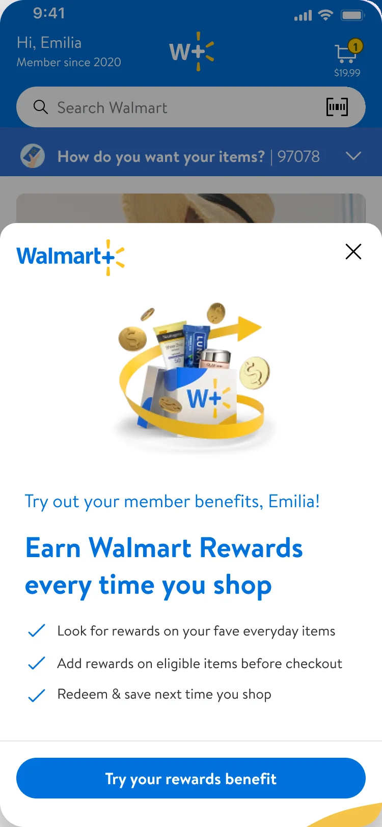
- Surface
- Surface to tint, 135°
- Outline
- 1px line, sage at 35% on hover
- Radius
- 24px
- Padding
- 44 by 48, 30 by 24 on phones
- Hover
- Lifts 4px, grows 1.2%, the shadow deepens
- Phone
- Tilts toward the cursor on hover
conversion on a $3B checkout revenue line
An honesty note. It raises trust instead of lowering it: what the number shows, what it does not, and what I would do next time.
- Surface
- Surface
- Outline
- 1px line
- Radius
- 16px
- Padding
- 22px
- Number
- 600, tabular, 26 to 34px
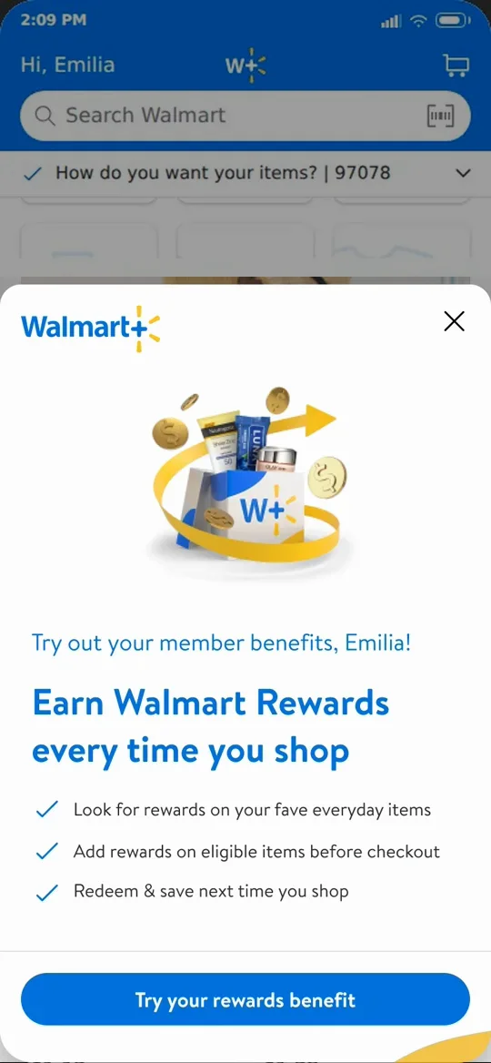
- Frame
- #1C1B1A, 7px bezel
- Radius
- 34px outside, 28px screen
- Width
- 240px, 300px large, 196px small
- Shadow
- Long, soft, low: 30px down, 50px blur
David has a rare ability to bring people together across product, engineering, marketing, and operations, and get everyone aligned around a clear vision that actually moves the business forward.
- Surface
- Copper 9% to surface to steel 12%, 135°
- Outline
- 1px line
- Radius
- 24px
- Quote
- 400, 21 to 28px, curly quotes
- Credit
- Mono, bottom right, no rule above
- TriggerA moment the member is already in.
- RitualOne benefit, by name.
- RewardA win, counted up.
- HabitThe next benefit, one tap away.
How I lead
Unifying the team.
Great teams often work in parallel. I help them work as partners.
The gap is rarely skill. It is alignment, and alignment can be designed.
I unify the org by making AI the default.
- LocalFinds14 Walmart teams, one journey
- Illumina40% less duplicated work
- RezilientDesign and eng ship from the
same code
- Org lead
- Area leads
- Group leads
- Team leads
- Team members
- Content design
- Research
- Field
- Navy, lit from the ring: #283D64 to #1E2D4A to #16223A
- Text
- Light roles inside the band; the heading takes the light gradient
- Marks
- 40px circles, one per line, the same size
- Proof
- Three chips: who, then the result; inline code once
- Thread
- 2px thread blue, 10px outside the card, 26px corners
- Width
- Edge to edge on the home page
Start with what people need and what the business has to move.
Then design it and build it in working code, from the opportunity down to the pixel.
- Field
- Copper 12% to navy 10% to steel 16% over paper, 135°
- Principle
- 500, 26 to 40px, no pronoun
- Method
- Indented 20 to 56px on a 2px thread-blue rule
- TrustTrust is a product featurePeople rely on an answer when they can see where it came from and how sure it is.Read the article ↗
- ControlWhere to keep people in controlWhich decisions stay with a person, and which the system can make alone.Read the article ↗
- InterfaceBeyond the chatboxSpecialized agents need more interface than a text field.Read the article ↗
- Cover
- 16:10, edge to edge, drawn in SVG
- Fields
- Midnight, forest, oxblood
- Accent
- One glow: gold or warm cream
- Lines
- 1.5 to 2.6 units, light at 40 to 95%
- Row
- Steps out to 1040px on the home page
Clients along the way
- Toyota
- Nike
- Intel
- Danaher
- Wells Fargo
- Royal Health
- Acura
- L'Oréal
- Radiometer
- Los Angeles County
- Mercedes-Benz
- Ouya
- Rezilient Health
- Renault
- IHS
- Names
- Inter 500, 20 to 28px, muted
- Divider
- 6px copper dot, 30px each side
- Edges
- Fade over 7%
- Motion
- 42s loop, pauses on hover, still under reduced motion
Desktop and phone
One system, two screens
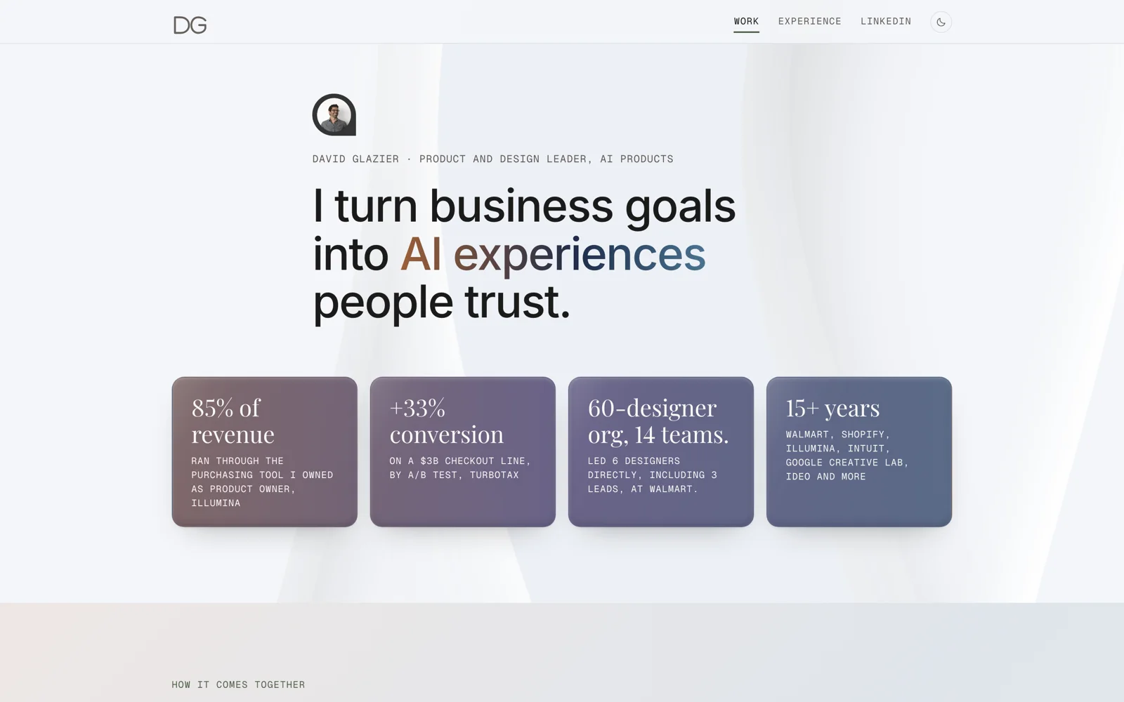
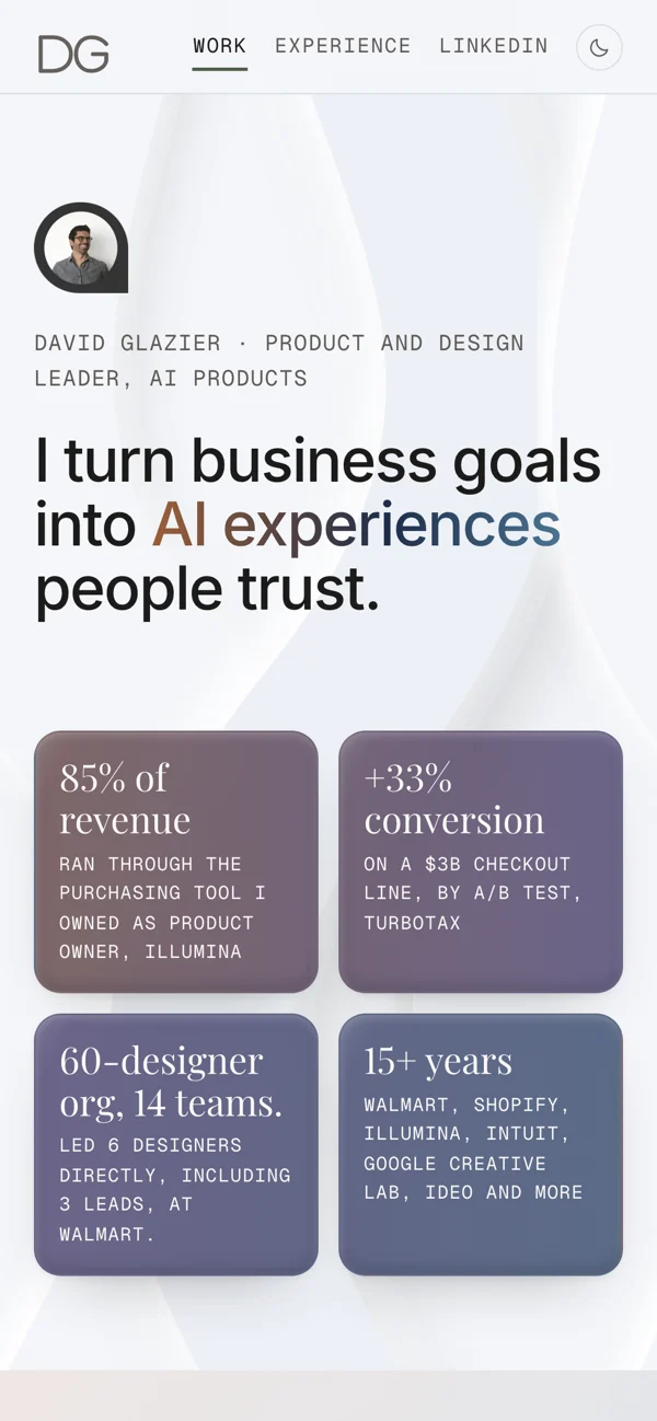
Every page is designed phone first and checked at 400px with no sideways scroll. Under 1240px the chapter rail becomes a pill; under 820px cards stack to one column and the phone leads.
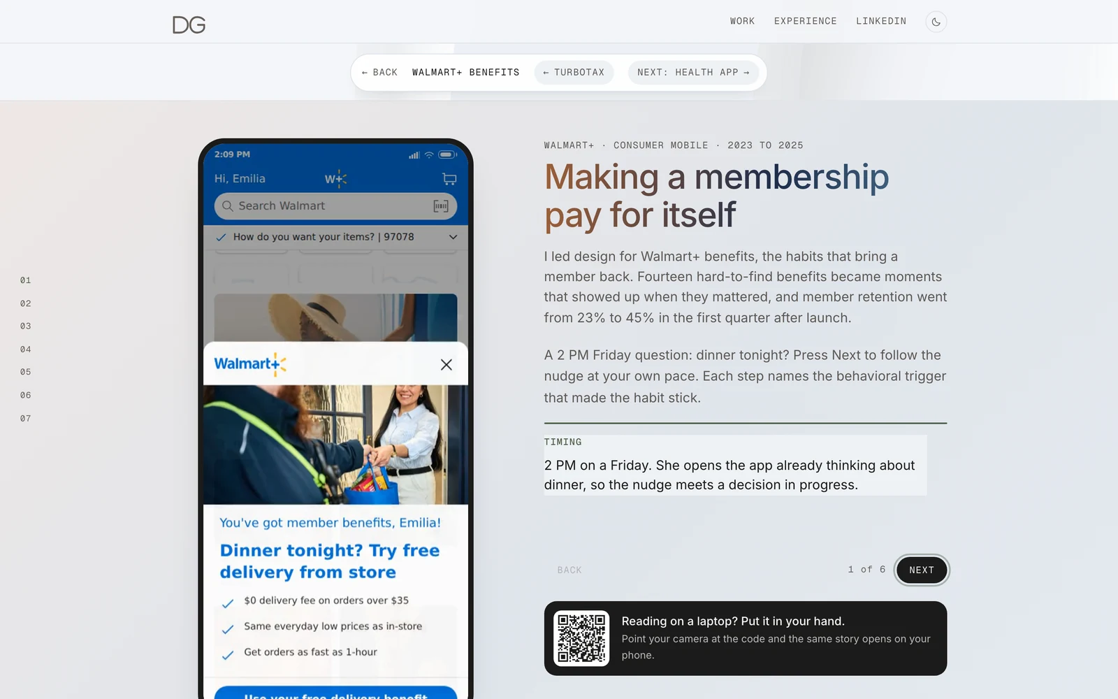
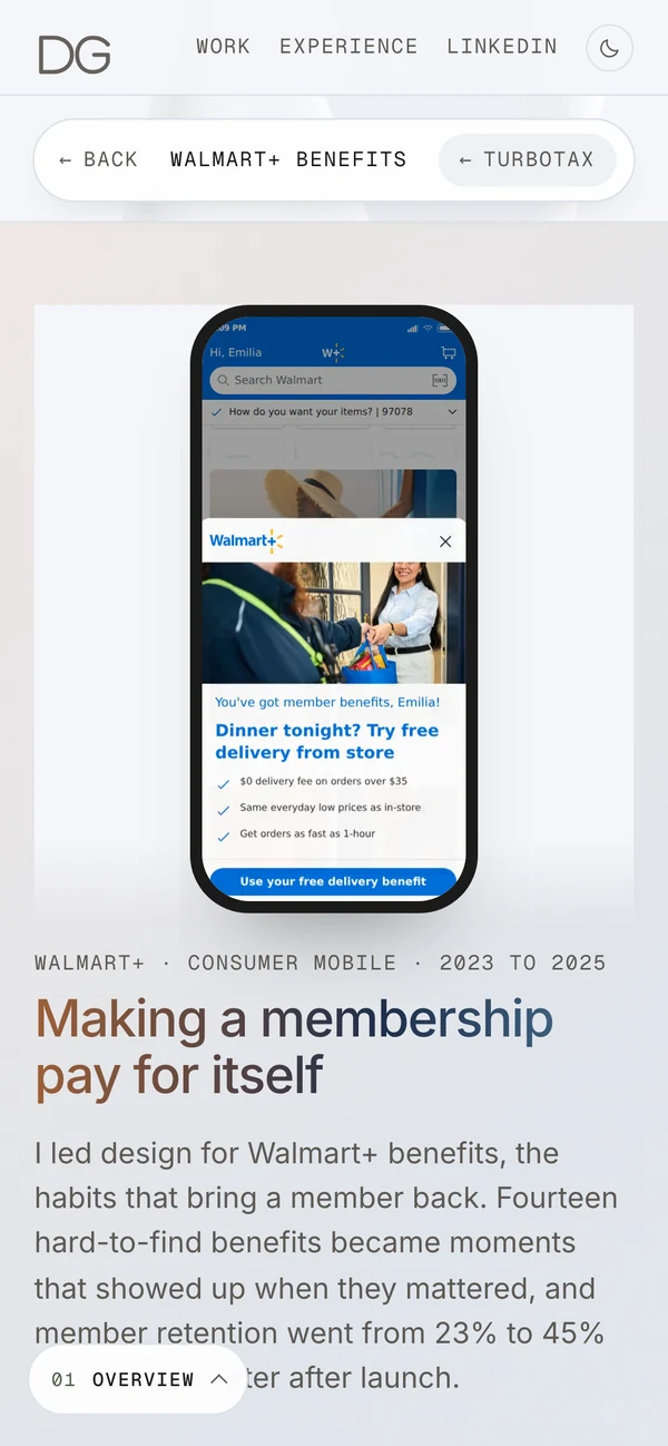
- Panel
- Tint to surface, 160°, 1px line, 24px radius
- Browser
- Surface, 1px line, 12px radius, a 20px bar with three dots
- Phone
- 5px bezel, 24px radius, overlaps the browser edge
- Width
- Up to 820px, past the reading column
- Motion
- Recordings play once when seen; hover replays both
Numbers
One number, in context, verified
- Before, then after.The old value comes first and smaller, then the new one counts up from it.
- Tabular figures.Every count uses tabular numerals, so the layout holds while the value changes.
- Gradient for the headline number only.The one result a card is about may carry the gradient. Supporting numbers stay in ink.
- Every number says what it counts.In the tile, or in the note under the grid: what was measured, and how.
- Shared results say so.A number that belongs to an org or a partner team is labeled that way.
- Verified or gone.Every number comes from the verified career record. Projections stay off the page.
Writing
Active, plain, under 25 words
- We for the team, I for what you owned."Prototype, design and ship in code" is how the team works; "I designed when the AI defers" is a decision owned. A principle drops the pronoun.
- Titles are outcomes."Making a membership pay for itself", never "Walmart+ benefits redesign".
- Questions are in the user's words."How much incentive is enough?" One per card.
- One number per paragraph.Inside the sentence, where it has context.
- No dashes of any kind.Commas, colons, and periods do the work. A scan runs before every commit.
- Acronyms are spelled out on first use.GMV (gross merchandise value), WCAG (Web Content Accessibility Guidelines).
- No process nouns.Nothing is leveraged, nothing is a synergy, nobody is a stakeholder.