Chapter 01 · Challenge
They joined for it. They never used it.
Why were members not renewing? It looked like a marketing problem. It wasn't. Fuel was the clearest case: members named fuel savings as a big reason they joined, and very few ever used it. Walmart+ had 14 benefits, each owned by a different partner team, and most members used one, if any. They didn't know what they had, and a member who never feels the value does not renew.
The hubFourteen benefits from ten partner teams, all on one screen. Every team believed its benefit should be the first one a member met.
- 14benefits
- 10partner teams
- 1screen
Welcome, Emilia!
Your member benefits
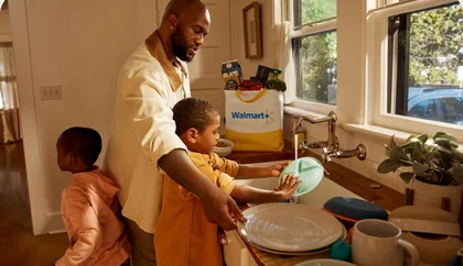 Free deliveryFrom your store, on orders $35+
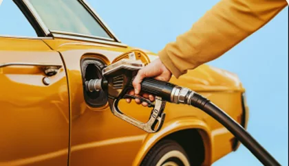 Fuel savingsSave at Exxon, Mobil and Walmart
 Paramount+Streaming, included
 Burger KingSavings on digital orders
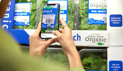 Scan & GoSkip the line in store
 Express deliveryIn an hour or less
 Walmart+ TravelMember deals on trips
 InHome deliveryStraight to your fridge
 Free shippingNo order minimum
 Early AccessFirst dibs on big deals
More with your membership
- Free online pet care›
- Auto care›
- Returns from home›
- Walmart Rewards›
A nudge, not a nag.
Chapter 02 · Why and when
Why and when come before where
Before we built anything, I asked three questions, in this order. Why should a nudge exist at all? When? And only then, where? Why: Emilia pays for free delivery and never uses it. When: most Fridays around 3 or 4 she orders dinner for the family, so we nudge at 2, while she is already thinking about dinner. That's the intelligence behind a smart nudge: same message, different moment.
Then where. We put a splash when the app opens, a slot on home, the delivery time picker and the cart in front of people in moderated studies, then proved the winners live. A splash interrupts why she opened the app, but on a Friday at 2, why she opened it is dinner. Timing changes the math.
AI was never the feature. It was the timing. Engineering gave us the signal: a model that predicted which benefit she was likely to use, geofencing for when she was near the pump or the door, and a rules engine for how often we could speak. My team designed the moment, for the two personas most likely to renew. The rule I held: a nudge, not a nag. She chooses, she sees her progress, and it knows her.
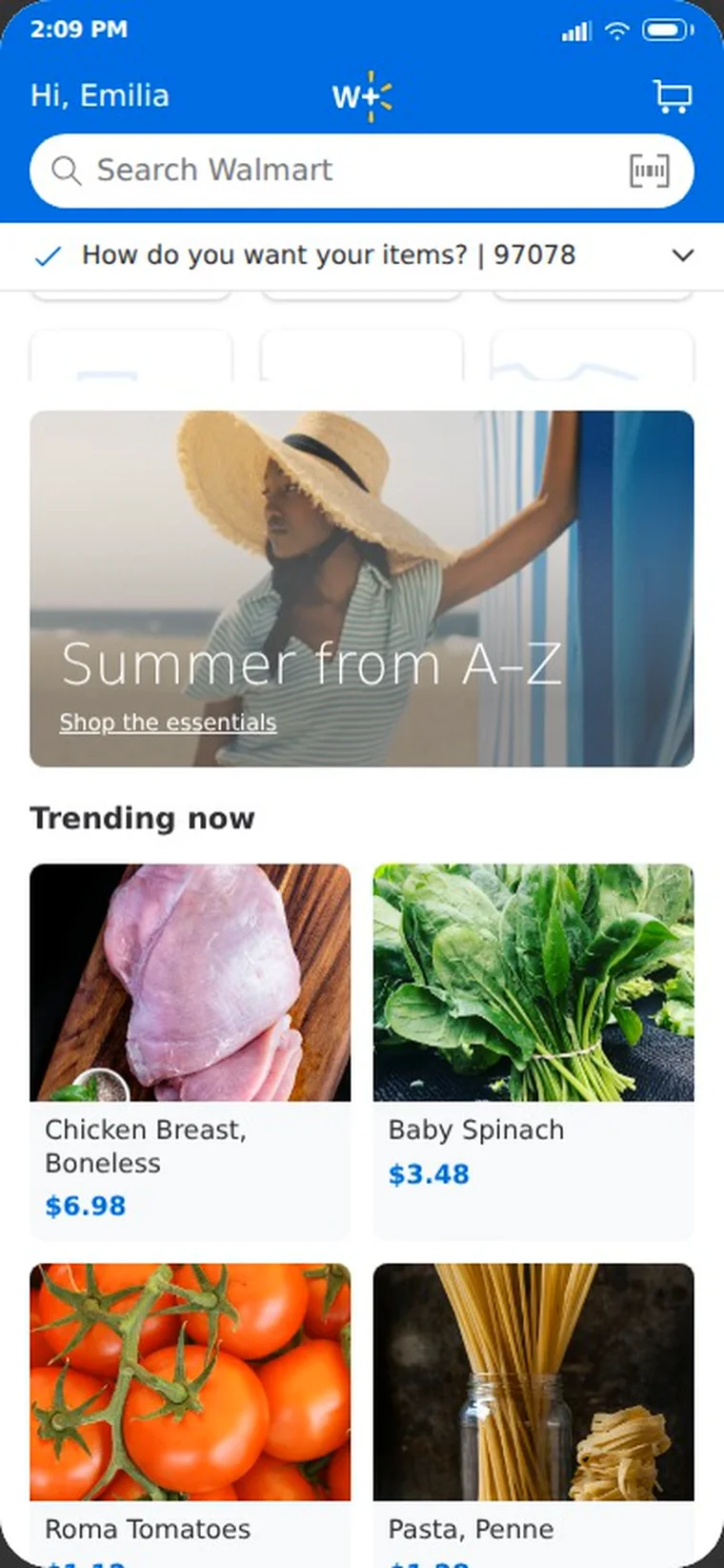
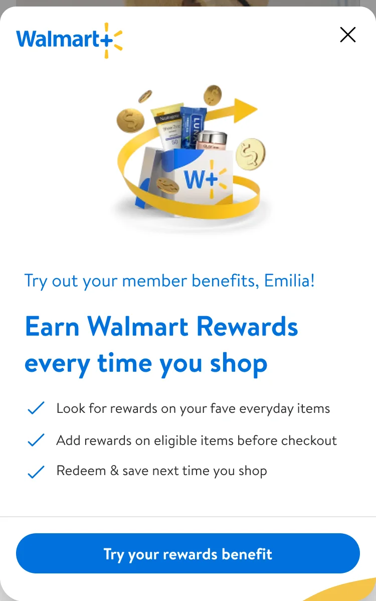
Chapter 03 · Craft
The craft behind it
The chapters around this one tell what we decided and what it moved. This one opens the files: one sheet, how it moves, and the rules for when it shows up.
My team designed the surfaces with ten partner teams. I led the key design and the animation for the benefits system.
Craft 01 · Anatomy
One sheet, six parts
Fourteen benefits from ten partner teams needed one way to reach a member in the moment. We designed one sheet where every part does one job. Three parts carry the behaviors from the walkthrough: ownership, competence, autonomy.
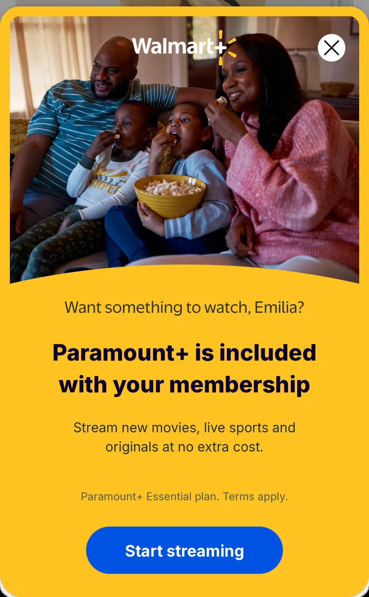
The Paramount+ sheet over the app home, from the Walmart+ screens. Tap a note to find its part.
Craft 02 · System
One frame, five benefits
Only the photo, the words and the action change. The order of the parts never does, so a member learns the sheet once.
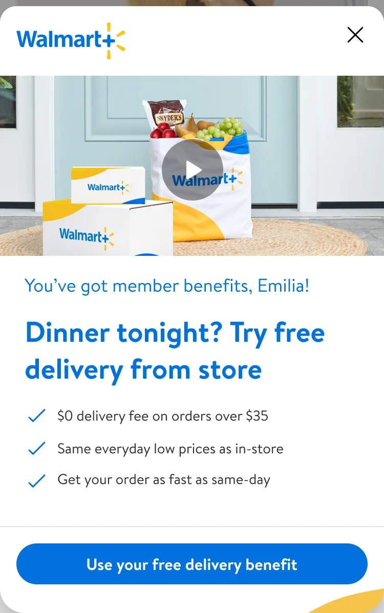
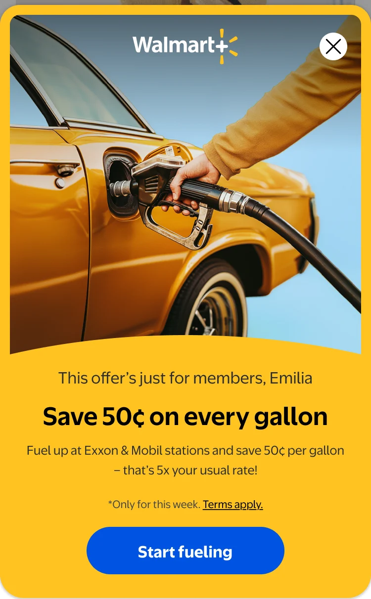
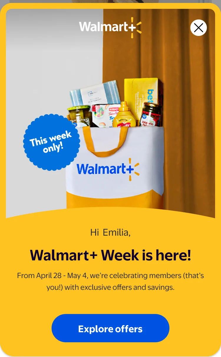
Five benefits, one anatomy
ChangesPhotoWordsAction
StaysSix parts, same order
Five Walmart+ sheets in one frame, each held for 2.4 seconds. Pick one to stop on it.
Craft 03 · Iteration
First version, later version
The first sheets were white, with three checkmarks and a full-width button. Later ones moved to a yellow frame with one promise, one line of support and a pill button. Same six parts, in the same order.
What changed
- Frame
White→A yellow frame - Photo
A band under the logo→Up top, the logo on it - Message
Three checkmarks→One promise, one line of support - Button
Full width→A pill - KeptThe six parts, and their order
Two benefits in one template: compare the frame, not the words. Drag the divider, or focus it and use the arrow keys.
Craft 04 · Timing
Friday at 2 PM
Emilia buys dinner most Fridays around 3 to 4, so the nudge lands at 2, before she decides. It stays out of the times it makes no sense, like getting ready for work, or dinner itself.
- 6 AMGetting ready for work. Quiet.
- 2 PMThe free delivery nudge, before she decides.
- 3 to 4 PMHer usual Friday dinner order.
- 5 PMDinner itself. Quiet again.
An illustrative Friday drawn from the pattern in the walkthrough, not one member's data. The home is the app at 2:09 PM.
Craft 05 · Cadence
Seen, no tap, move on
The sheet was half the design. The other half was how often it shows up, and what happens when she ignores it. We built a cadence for why, when and how often, and we counted every view.
- 1 · ShownCountedEvery view is counted, so we know how often she's seen it.
- 2 · TappedStraight to the jobDinner in the cart, or a show playing.
- 3 · Seen, no tapMove onMaybe it's not relevant to her. The next moment gets a different benefit.
- 4 · RestBring it back laterTwo weeks or three months, depending on what it is.
We know if they've seen it and they didn't interact with it, then we'll move on to a different experience. But we won't shove it.
In my words
The time between steps is shortened so the loop fits on one screen.
Craft 06 · Control
A way out, always
Every sheet keeps its close in the same corner. Tap it, and the sheet drops, the scrim fades, and the home she opened is back.
Same corner, all five sheets
- Dinner
- Rewards
- Streaming
- Fuel
- Event
Tap the close on the screen to try it.
Craft 07 · Motion
Celebrate the win, then point to the next
Redeeming once is not a habit. Every win counts up the savings, shows the year passing the price of the membership, and points to the next benefit.
The savings celebration, recorded. Tap a note to jump to that beat.
Craft 08 · Walmart+ Week
From the sheet to the pump
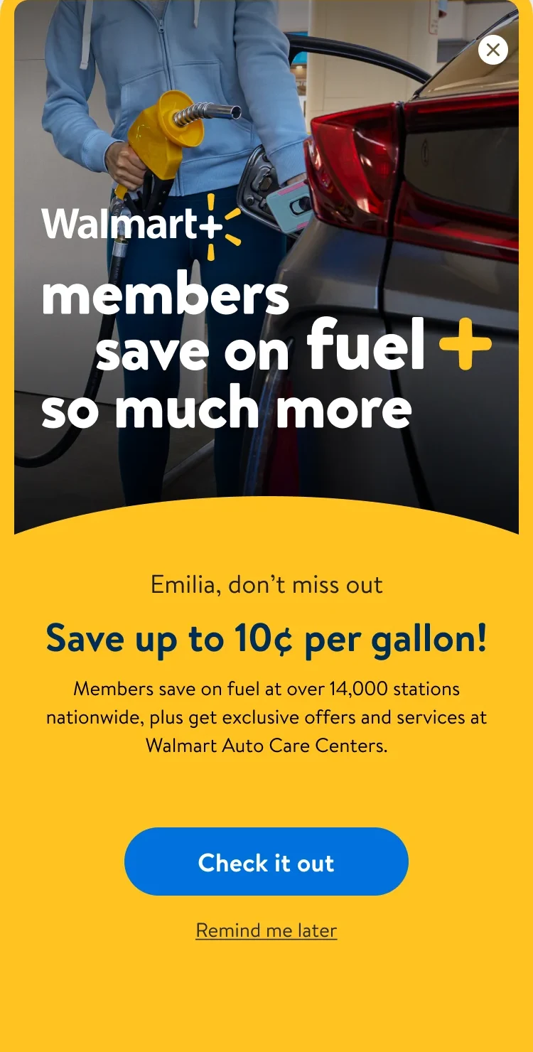
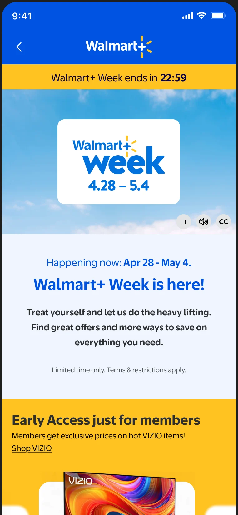
During Walmart+ Week, the fuel sheet took a member from the home to the pump in five screens. It opens on the same anatomy, then goes straight to the job.
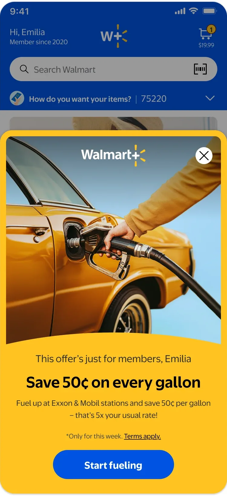
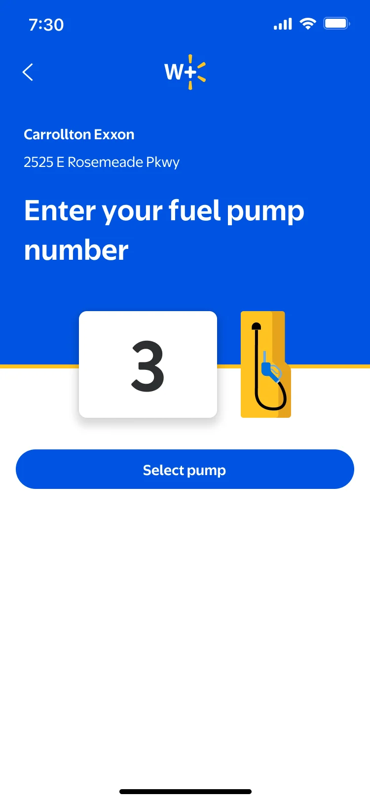
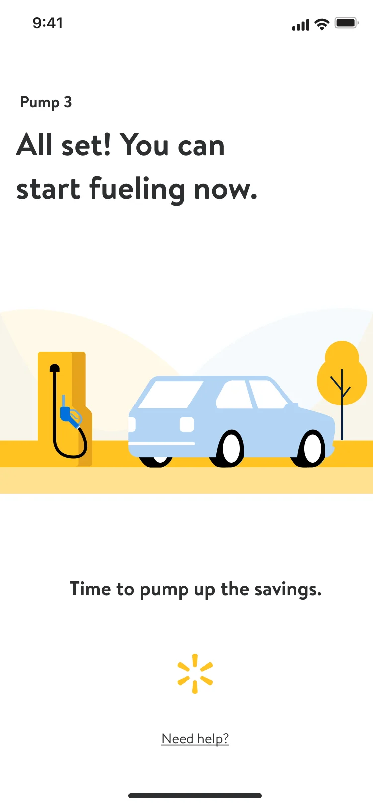
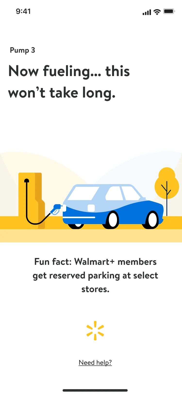
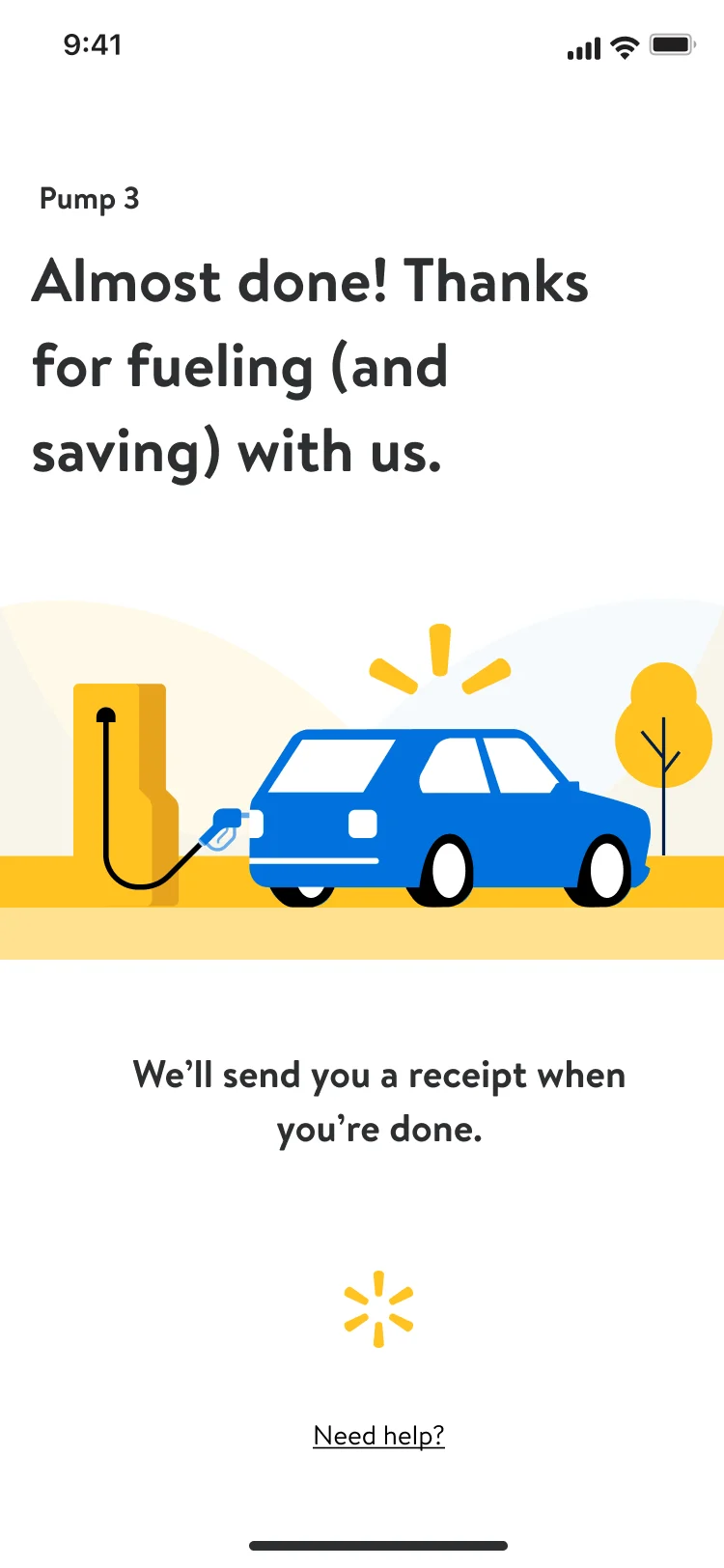
Five screens from the Walmart+ Week work. Tap a note to jump to its screen.
Chapter 04 · The call
The call I made: prove what the money does
Before we spent more on incentives, I wanted a baseline. Is the money doing the work, or the nudge? So every nudge ran two ways: on its own, and with an extra incentive on top.
Does an extra incentive change behavior?
Baseline nudges against the same nudges plus an incentive. Fuel moved most: 10 cents a gallon against 20 cents.
Does showing progress drive a second benefit?
"1 of 14 benefits used" ran in both arms. It lifted retention and new sign-ups at once.
How far should we push it?
Walmart+ Week offered 50 cents at Exxon and Mobil. It performed about the same as 20 cents, so 20 cents stayed the default. That was the return-on-investment call.
Chapter 05 · Build
One nudge, five moments, then celebrate the win
The benefits did not change. When and where they showed up did. One nudge pattern travels to every place a benefit is usable, and every win ends in a celebration that points to the next one.
- Five momentsOne nudge pattern, placed wherever a benefit is usable: the app home to trigger, the item page to reinforce, streaming to discover, the store to delight, the pump to build the habit.
- CelebrationRedeeming once is not a habit. Every win counts up the savings, shows the year passing the price of the membership, and points to the next benefit: after delivery, Paramount+, not more delivery.
- LibraryThe part I'm proudest of. Hub, nudges, offer and event pages came from one set of components, so Walmart+ Week launched in one week instead of two to three months, and we did it again for the holidays.
- PrototypeA Figma prototype on real screens, so partner teams reviewed the moment, not a flowchart.
Chapter 06 · Results
Retention nearly doubled
We named what we would not break before we shipped: gross merchandise value (GMV) and orders. Deciding what you won't break is how you earn the right to experiment.
The honest part: we tested variants against each other, not against a no-nudge group. Our partners wanted the lift more than the attribution, and Walmart+ Week landed in the same window. So I can't say how much of the lift the design alone drove. I can say the nudges won their tests. Next time I would hold a group back from day one.
Chapter 07 · My role
Credit where it belongs
Six designers in two pods, ten partner teams. Everyone owned a focus area and worked directly with me, once a week we all worked live on whatever was hardest, and we celebrated wins out loud. I was a player coach and stayed in the files.
- StrategyStrategy, key design, and the animation for the benefits system.
- AlignmentAligned leaders and 10 partner teams on one sequence.
- TestsChose the two tests on judgment, and set discount depth against progress.
- TeamThe project template and rituals every designer started from, and the research protocols.
My team designed the surfaces: hub, onboarding, nudges, badging and reactivation, plus content and accessibility. Partners supported the studies, built the product and owned the incentive budget. When I say we, this is what I mean.
Next project
Hybrid care, redesigned for patients and providers
The patient app, the clinical tools and the system under both, with an assistant that knows when a question belongs to a doctor.
Read the case